Tim Lau
Saturday, 16 June 2018
Wednesday, 9 May 2018
EXP3: WEEK ONE
ONE POINT PERSPECTIVES

ARTICLE:
Chua, G 2018. Three Emerging Architecture Practises to Watch, Architecture and Design, accessed 9 May 2018, <https://www.architectureanddesign.com.au/sustainability-awards/three-emerging-architecture-practices-to-watch >.
ONE POINT PERSPECTIVES

ARTICLE:
- Space
- Perception
- Ever-changing
- Memory
"Architecture should embrace the space upon which it sits whilst exemplifying an ever-changing, dynamic form so that those who perceive it will have a unique and lasting memory of its composition."
Saturday, 28 April 2018
EXP2 FINALS:
TEXTURES
Final Sketchup Model:*
https://3dwarehouse.sketchup.com/model/bbd98642-8af1-42c8-8099-d6b907124bd2/EXP2-Light-Rail
Final Lumion Model:**
https://drive.google.com/file/d/1ISkmpHQVx1aoAToTPOAmi0f6lEzcswh0/view?usp=sharing
Other images can also be viewed on my portfolio: http://timlauportfolio.weebly.com/
https://drive.google.com/file/d/1ISkmpHQVx1aoAToTPOAmi0f6lEzcswh0/view?usp=sharing
Other images can also be viewed on my portfolio: http://timlauportfolio.weebly.com/
Images rendered in 3840x2160 resolution in Lumion, then post processed in Photoshop for colour grading, lighting, and ornamental adjustments.
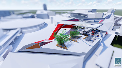
OBLIQUE AERIAL: This oblique aerial showcases three key philosophies that have been derived from Decimus Burton and Moneka Makeka:
- [Burton] "His architecture was endlessly adaptable, leaving the archaeological traces of each generation"
- [Burton] "Architecture happens in time whereas music begins and ends"
- [Makeka] "[Makeka] wished to create a service to the public. Everybody has a right to experience good design"
As seen in this shot, the lower canopy has skylights that open up into the east allowing for maximum daylight exposure without compromising heating issues associated to sunlight from the west. Similarly, the open form of the entrance (on the walkway side) maximises the sunlight that enters from the wide walkway and encourages a greater flow of people.
______
[A] View from University Main Walkway: The triangulated form is mirrored in the chosen texture which resembles delicate spikes of the banksia, one of many Australian flowers that are prominent in this area of Sydney. Consequently, this reflects Burton's idea that one must consider the "implications of architecture on the creation of distinct urban environments in which they featured."
______
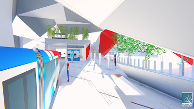
[B] View into the light rail stop entrance: One of the textures used has been converted into floor tiles which make up the platform concrete past the opal gates. The texture was created based on the green wattle, whose leaves point at perpendicular angles to its stem and thus mimics Burtons idea that architecture should leave "archaeological traces of each generation."
______
[C] View down Anzac Pde (in Maroubra direction): This inverted texture introduces a similar concept, where it references the curved leaves of the Waratah. The canopy above introduces a skylight and hence allows for a lighter and more open feel for commuters. Whilst it maximises daylight exposure, it also creates a wider opening entrance and accentuates the size of the space.
______
[D] View from upper courtyard space: The upper courtyard space functions both as a safer option to cross the light rail lines and also as a communal space, which reflects the multicultural concepts used as a premise for this project. This elevated structure allows the cars below to re-emerge to street level without disrupting the flow of the building and also serves a more recreational purpose.
________
Chosen Textures:


________
Non-Edited Lumion Renders:


________
Chosen Textures:


________
Non-Edited Lumion Renders:


*Please note: Light rail trains, cars, people, coffee cart and trees were downloaded from the 3D warehouse. All other ornaments were made from scratch (opal gates, light rail sign, top up booths, chairs, stairs, signs, etc)
**Please note: custom textures were unable to load into Lumion, so they were added in Photoshop to meet the brief
Subscribe to:
Posts (Atom)


